
View Case Study >

View Case Study >
View Case Study >
View Case Study >
View Case Study >
View Case Study >

View Case Study >

View Case Study >

View Case Study >

View Case Study >
View Case Study >
Book A Call >
OUR SERVICES
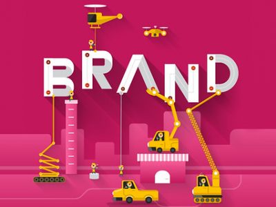
Brand Identity Design
Your brand identity is critical. It’s how you present yourself to the world and how people perceive your organization. From the initial concept to a comprehensive identity system with brand identity standards, we help organizations like yours grow their brands and reach their business objectives.
SEE EXAMPLESDigital and Web Design
The times are changing, and digital is in the driver’s seat. We’re creating engaging, relevant content that gets results. From email campaigns and social content to websites and mobile apps, we’re working to build your brand identity with every piece, and we have the ideas you need to get your message to your customers.
SEE EXAMPLESPrint Media Design
Classic. Timeless. Versatile. Print media can do it all. It’s an impactful and effective way to bring your identity to life, and we’re ready to make your brand shine in a variety of ways. If you can print it, we can design it.
SEE EXAMPLESFrom Start To Finish, We’re With You Every Step Of The Way
BOOK A CALLOUR PROCESS
Brief
Investigate
Research
Evaluate
Explore
Experiment
1. Discover
 2. Design
3. Develop
4. Deliver
2. Design
3. Develop
4. Deliver
Brief
Investigate
Research
Evaluate
Explore
Experiment
Refine
Critique
Evolve
Deploy
Implement
Review
MORE DETAILS
We Provide Everything You Need To Go To Market And Outshine The Competition
BOOK A CALLWHO WE SERVE
In-House Marketing Departments
Marketing Agencies
Business Leaders and Entrepreneurs
Non-Profit / Government Organizations
Everyone at KURTZ was so wonderful to work with. We LOVE the logo and the way you guys created the unique aesthetic we were going for. It was crazy trying to coordinate everything that goes into opening a store, but you guys made this aspect so easy. Thank you, KURTZ!
Melanie Brunty
Owner
The Farmer's Rail
Owner
The Farmer's Rail
Creating a new brand for our household cleaning products seemed a daunting task. We didn’t know where to begin! KURTZ did everything for us, from helping with creating the brand identity to the website, e-commerce, and creating all the graphics, including a commercial and so much more! Working with James and his team was incredibly easy. Thank you, James and KURTZ, for the fantastic job and making it so effortless to launch a new vision.
Claudia Crea,
President and CEO
Qual Chem LLC/B+B Cleaners
President and CEO
Qual Chem LLC/B+B Cleaners

I truly enjoy working with Jim. [H]e has a great attitude, a willingness to ‘get the job done’ even under unreasonable timelines and he’s self-motivated…and best of all, [he’s] highly creative.
Sue Oshaben
Senior Graphic Designer
Little Tikes Toy Company
Senior Graphic Designer
Little Tikes Toy Company
The KURTZ team has been hands down the best creative agency I've ever worked with, and I've worked with many in my 20+ year career in digital marketing. The team is fairly priced, efficient, responsive, and deadline-oriented, and the details do not get past them.
Jeff Worcester
Vice President of Digital Marketing
Child Craft
Vice President of Digital Marketing
Child Craft
Jim Kurtz is an extremely talented graphic designer. His knowledge for design coupled with his understanding of brand identity, truly made my job easier. Jim has an outstanding ability to complete complex projects rapidly in order to meet deadlines. In addition to his talent as a designer, I believe Jim’s ability to be organized, even within chaos makes him one of the best designers I have had the privilege to work with.
Vicki Prussak
Graphic Marketing Manager
TTI Floor Care North America
Graphic Marketing Manager
TTI Floor Care North America
Being a local CLE company, for our 50th anniversary, we chose Jimmy and his staff to work on our Mr. Chicken rebranding. They did fantastic work, listening to our needs and coming up with creative solutions. Our core guest base loved the changes and we grew our business with new guests. Everyone who sees our new logo and box artwork comments on how attractive the updated look is, while retaining our identity.
Thank you Kurtz Graphic Design!
Michael Simens
Owner
Mr. Chicken
Owner
Mr. Chicken
Not only am I satisfied by the end result, I thoroughly enjoyed the entire process and would happily recommend KURTZ to anyone in need of their services. I have received a ton of positive feedback from employees, family, friends, and customers who seem just as excited about our new look as I am.
Eric Bernard
Owner
Bernard Mechanical Inc.
Owner
Bernard Mechanical Inc.
Public response to our new brand has been overwhelmingly positive. This change accurately represented our founder’s personality and the culture of the foundation.
Victoria Romanda
Chief of Staff
Peg’s Foundation
Chief of Staff
Peg’s Foundation
James truly listened to what I was looking for... He took what was in my imagination and only after a brief meeting was able to organize it and develop it into a cohesive and effective layout. His work is professional and timely. James provided creative design while respecting our current brand. He has on-the-spot creativity and the deep technical knowledge that can positively affect any company’s image.
Jason Long
Vice President
The Fussy Cleaners
Vice President
The Fussy Cleaners
I love the site! You guys are awesome as usual!!!
Liz Rowsey
Internet Development Supervisor
Hedstrom - Ball, Bounce & Sport, Inc.
Internet Development Supervisor
Hedstrom - Ball, Bounce & Sport, Inc.
KURTZ has always provided exceptional creative design for both B2B and B2C. They were involved in all aspects of our business from digital, to print, to art directing our photography. The KURTZ team is very organized and they always meet our deadlines. They have been a huge asset to our company.
Liesl Emrikian
Vice President of Product Development
Foundations World Wide, Inc.
Vice President of Product Development
Foundations World Wide, Inc.
I lost count of how many times it was Jim’s commitment, energy, and good humor that allowed us to complete important, high profile communications projects. Jim is one of the best designers I have ever worked with, in all senses—technically, creatively, and interpersonally. He has a wonderful work ethic, an easygoing yet focused style, integrity, flexibility, and adaptability.
Marcelyn Kropp
Marketing Coordinator
Ohio University Alumni Association
Marketing Coordinator
Ohio University Alumni Association

Very friendly and talented staff. Our business has used them for multiple photo shoot and design projects. I would highly recommend them for anyone looking for high quality, modern design work for their business.
Nathan Logan
Director of Business Development
BOSU
Director of Business Development
BOSU
The Kurtz Graphic Design Co. created our club's logo. Over the years, it's been widely praised for its unique and bold look. James and his team were always friendly, professional, and timely during the creation process. Thank you many times over for giving us a special symbol to rally around!
Rob Bell
Owner
Ballistic United
Owner
Ballistic United
We had two main concerns: the brand needed to look established, and we needed support from start to finish. James and his team at KURTZ always communicated with us, and they made what I thought would be a huge undertaking feel easy. We never felt in the dark, and they finished everything on deadline. I couldn’t ask for a better experience.
Owner
Oystr Payments
Oystr Payments
A professional team skilled in design and detail that has become such a positive extension of our company.
Michelle Vinson
Co-Founder
Social Butterfly Studio
Co-Founder
Social Butterfly Studio

James and Ryan are top notch. I had a fun time making this video that will pay off big time for our company.
Dan LaCarte
President
Model Cleaners
President
Model Cleaners
We have really enjoyed working with Kurtz Graphic Design Co. Very professional and great quality!
Jackie Wachter
Owner
FOUNT
Owner
FOUNT
Everyone at KURTZ was so wonderful to work with. We LOVE the logo and the way you guys created the unique aesthetic we were going for. It was crazy trying to coordinate everything that goes into opening a store, but you guys made this aspect so easy. Thank you, KURTZ!
Melanie Brunty
Owner
The Farmer's Rail
Owner
The Farmer's Rail
Creating a new brand for our household cleaning products seemed a daunting task. We didn’t know where to begin! KURTZ did everything for us, from helping with creating the brand identity to the website, e-commerce, and creating all the graphics, including a commercial and so much more! Working with James and his team was incredibly easy. Thank you, James and KURTZ, for the fantastic job and making it so effortless to launch a new vision.
Claudia Crea,
President and CEO
Qual Chem LLC/B+B Cleaners
President and CEO
Qual Chem LLC/B+B Cleaners
I truly enjoy working with Jim. [H]e has a great attitude, a willingness to ‘get the job done’ even under unreasonable timelines and he’s self-motivated…and best of all, [he’s] highly creative.
Sue Oshaben
Senior Graphic Designer
Little Tikes Toy Company
Senior Graphic Designer
Little Tikes Toy Company
The KURTZ team has been hands down the best creative agency I've ever worked with, and I've worked with many in my 20+ year career in digital marketing. The team is fairly priced, efficient, responsive, and deadline-oriented, and the details do not get past them.
Jeff Worcester
Vice President of Digital Marketing
Child Craft
Vice President of Digital Marketing
Child Craft
Jim Kurtz is an extremely talented graphic designer. His knowledge for design coupled with his understanding of brand identity, truly made my job easier. Jim has an outstanding ability to complete complex projects rapidly in order to meet deadlines. In addition to his talent as a designer, I believe Jim’s ability to be organized, even within chaos makes him one of the best designers I have had the privilege to work with.
Vicki Prussak
Graphic Marketing Manager
TTI Floor Care North America
Graphic Marketing Manager
TTI Floor Care North America
Being a local CLE company, for our 50th anniversary, we chose Jimmy and his staff to work on our Mr. Chicken rebranding. They did fantastic work, listening to our needs and coming up with creative solutions. Our core guest base loved the changes and we grew our business with new guests. Everyone who sees our new logo and box artwork comments on how attractive the updated look is, while retaining our identity.
Thank you Kurtz Graphic Design!
Michael Simens
Owner
Mr. Chicken
Owner
Mr. Chicken
Not only am I satisfied by the end result, I thoroughly enjoyed the entire process and would happily recommend KURTZ to anyone in need of their services. I have received a ton of positive feedback from employees, family, friends, and customers who seem just as excited about our new look as I am.
Eric Bernard
Owner
Bernard Mechanical Inc.
Owner
Bernard Mechanical Inc.
Public response to our new brand has been overwhelmingly positive. This change accurately represented our founder’s personality and the culture of the foundation.
Victoria Romanda
Chief of Staff
Peg’s Foundation
Chief of Staff
Peg’s Foundation
James truly listened to what I was looking for... He took what was in my imagination and only after a brief meeting was able to organize it and develop it into a cohesive and effective layout. His work is professional and timely. James provided creative design while respecting our current brand. He has on-the-spot creativity and the deep technical knowledge that can positively affect any company’s image.
Jason Long
Vice President
The Fussy Cleaners
Vice President
The Fussy Cleaners
I love the site! You guys are awesome as usual!!!
Liz Rowsey
Internet Development Supervisor
Hedstrom - Ball, Bounce & Sport, Inc.
Internet Development Supervisor
Hedstrom - Ball, Bounce & Sport, Inc.
KURTZ has always provided exceptional creative design for both B2B and B2C. They were involved in all aspects of our business from digital, to print, to art directing our photography. The KURTZ team is very organized and they always meet our deadlines. They have been a huge asset to our company.
Liesl Emrikian
Vice President of Product Development
Foundations World Wide, Inc.
Vice President of Product Development
Foundations World Wide, Inc.
I lost count of how many times it was Jim’s commitment, energy, and good humor that allowed us to complete important, high profile communications projects. Jim is one of the best designers I have ever worked with, in all senses—technically, creatively, and interpersonally. He has a wonderful work ethic, an easygoing yet focused style, integrity, flexibility, and adaptability.
Marcelyn Kropp
Marketing Coordinator
Ohio University Alumni Association
Marketing Coordinator
Ohio University Alumni Association
Very friendly and talented staff. Our business has used them for multiple photo shoot and design projects. I would highly recommend them for anyone looking for high quality, modern design work for their business.
Nathan Logan
Director of Business Development
BOSU
Director of Business Development
BOSU
The Kurtz Graphic Design Co. created our club's logo. Over the years, it's been widely praised for its unique and bold look. James and his team were always friendly, professional, and timely during the creation process. Thank you many times over for giving us a special symbol to rally around!
Rob Bell
Owner
Ballistic United
Owner
Ballistic United
We had two main concerns: the brand needed to look established, and we needed support from start to finish. James and his team at KURTZ always communicated with us, and they made what I thought would be a huge undertaking feel easy. We never felt in the dark, and they finished everything on deadline. I couldn’t ask for a better experience.
Owner
Oystr Payments
Oystr Payments
A professional team skilled in design and detail that has become such a positive extension of our company.
Michelle Vinson
Co-Founder
Social Butterfly Studio
Co-Founder
Social Butterfly Studio
James and Ryan are top notch. I had a fun time making this video that will pay off big time for our company.
Dan LaCarte
President
Model Cleaners
President
Model Cleaners
We have really enjoyed working with Kurtz Graphic Design Co. Very professional and great quality!
Jackie Wachter
Owner
FOUNT
Owner
FOUNT
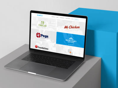
SOME OF OUR CLIENTS
We Are Passionate About What We Do
BOOK A CALLWHO WE ARE
Creative Director
Jim, Jimmy, James, he'll answer to all three. Like most kids growing up he loved to draw, he just never stopped. Trained in the Swiss disciplines of design via a BFA from Ohio University he has been perfecting his craft professionally since 1999.

Sr. Graphic Designer
With a lifelong passion for design and a mind that’s eager to think creatively and solve problems, Chuck has the skills to get things done. He is the powerhouse behind our production schedule. Cranking out work faster and better than thought humanly possible.

Graphic Designer
Abby started at KURTZ as an intern a few years ago, and since has graduated from Kent State University majoring in Visual Communication Design with a minor in Photo Illustration. Now, she is a full-time part of our creative team. Abby is our in-house hand letterer, orange slice eater and Galaga cheerleader.

Graphic Designer
Drawing shoes and jerseys since he can remember, design has been a passion his whole life. Born and raised in Cleveland, Ohio, Travis enjoys the outdoors and anything to keep him active. Freshly out of Ohio University with a BFA degree and minor in marketing, he can now solve a rubik's cube and break out the worm dance.

When you work with The Kurtz Graphic Design Co. you also have access to the talented members of the Summit Collective. Summit Collective is a group of creative professionals who work both independently and collaboratively to offer businesses and nonprofits a wide range of services—such as graphic design, web and app development, photography, videography, social media, public relations, digital strategy, copy writing, and copy editing. Acting as your full-service creative agency, yet instead of maintaining a high level of resources and overhead, working on an as needed basis to fulfill the specific objectives of each particular project, thus lowering costs, increasing savings, all while providing comprehensive, quality services.

Joren Rapini
Web & App Development

Ryan Smas
Photography & Videography

Laura Petrella
Copy Editing

Ashley Smas
Photo Styling

Dustin Fatch
Search Engine Optimization & PPC

Morgan Lasher
Digital Marketing

Kat Pestian
Public Relations

Joe Greenwell
Copywriting

Jay Mellon
Information Technology, Managed Services

Bill Myers
Augmented & Virtual Reality
This one is "On The House"
They say a picture is worth a thousand words, but we think when it’s a highly crafted professional image it’s actually much more. Just how much is a question that’s difficult to determine. After all, how do you quantify quality? The answer: you don’t. Through our pro-bono program, “On The House,” we help in-need organizations get the high-caliber graphic design they need to accomplish their initiatives. It’s our way of giving back to those who are giving back. Submit your project needs to us and see how good design can help you make a difference.